I'll do a Daily Special today and it's "Technique Day" - Coloring with pencils. I used a very cheap pencil that I recently bought at Michael's. This set of 24 was only $12.99. Prisma color pencils are $48 I believe for a set of 24 so a $12.99 set is considered very cheap. These pencils are made by Koh-I-Noor. This set of pencils are softer than other lead pencils so it was easier to blend with them. It didn't take as much work to blend as the harder lead pencils.

Here is a basic tutorial on coloring:
I used a regular matte cardstock to stamp my image.
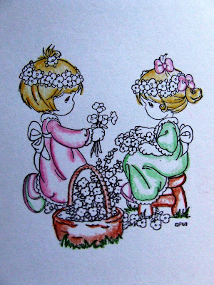
First step: Outline your image. Save the detailed parts of the image for last.
Step 2: In a circular motion, from the outline inwards, color in the image using a small amount of pressure. Don't color in a straight up and down motion, circular strokes are best. Don't worry if your coloring don't look that pretty. This is just the base.
As you can see I left the centered areas uncolored. These areas will be the highlighted areas. Imagine where your light source and where you would think the light would shine on your image. . .it could be to the left side, right, or middle - whichever side, be consistent.
In my example below, my light source (in my mind - not literally) is slightly above and centered on the image, therefore the highlights will be at the center. Does it make sense?
For vases and jars, you may initially want to color in a horizontal motion following the
curvature of the vase or jar then start to use a circular motion as you color inwards. The same applies with folds such as clothing.
You need to use a little bit of your imagination. Just think where shadows would appear. . .under a fold, under the chair. . .color those areas darker than areas exposed to light, again in a circular motion.
When coloring hair, color the outline and slightly outside of the outline but don't color the whole head of hair. It's even okay to leave some parts of the hair uncolored - just fade out your coloring as you head towards the center. Hair at the top of the head is usually lighter than the bottom so color those areas accordingly.

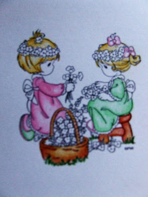
Step 3: Sorry but the picture is blurry. Now, with lighter pressured circular motion, continue to color inwards from the originally shaded areas. Color the shaded areas as well, blending the colors in, but while you're coloring inwards from your outline towards the center, place less pressure on your coloring strokes. The lightest strokes are reserved for the center . . .barely color in as you head towards the center.

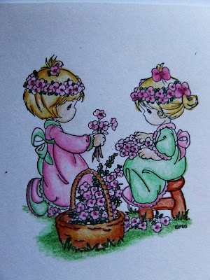
Last step: Color in the detailed parts of your image. For flowers, color the center and under the flowers darker than the outer parts of the petals (in real life, the outer parts of the petals are exposed to the sun, therefore would be lighter than the inner portions of the flower). The same applies to leaves, as well as ribbons.

The key to coloring is your strokes and ability to add shading and highlights. Apply more pressure to your coloring for shaded areas, lighter pressure in highlighted areas. Always use circular motion to color and blend the colors in very well.
I used two types of brown for the basket and the stool. One lighter and the other a darker shade. I mixed and overlapped the lighter color with the darker color to prevent an obvious demarcation between the two colors.
Practice, practice, practice. . .it takes a while to get good at it but once you are able to control the amount of pressure applied to your coloring strokes, you'll get the results that you want.
<<>
That's it. Hope this tutorial helps a bit with coloring.
Until later. . .
 Today's Daily Special is Technique Day. The "Rock and Rolling" technique is a very simple technique and isn't new but because I used this technique on the card I created, I wanted to share it with those who are unfamiliar with this technique. This technique shades the edge of solid images as demonstrated by the flower image on the card I created to the right.


